I like the bee too, but I don’t think it would appeal to most people really- like I said before, bee’s apparently do have much in the way of cuteness factor D:

I do how ever think that I will keep this basic design, and probably brighten the bee up, make him fluffier, etc. The final design of course will also be a lot cleaner too.
Come to think of it, the font is really bothering me. I’ll upload in a bit with an update.
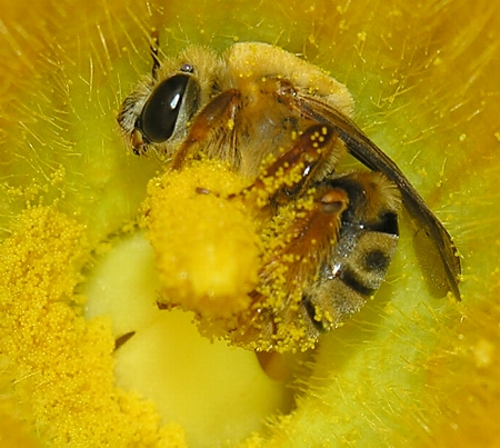
I used this vaguely as reference.

No comments:
Post a Comment